Changing the background colour of a ComboBox in WPF on Windows 8
Posted: April 30, 2014 Filed under: WPF, XAML | Tags: Visual Studio, WPF, XAML 7 CommentsThis post explains how to change the colours of a ComboBox in a WPF application by overriding the control’s default template in XAML using Visual Studio 2012 or 2013.
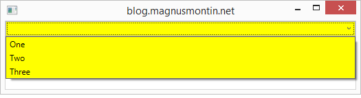
To change the background colour of a ComboBox in a WPF application running on Windows 7, you can simply set its Background property to a Brush object or a colour string in XAML and to change the colours of the visual ComboBoxItem objects that represents the different options in the ComboBox, you can just override some system defined brushes by adding your own Brush objects with the corresponding x:Key attributes to the ComboBox’s resources section:
<ComboBox Background="Yellow">
    <ComboBox.Resources>
        <!-- Colour of ComboBoxItem -->
        <SolidColorBrush x:Key="{x:Static SystemColors.WindowBrushKey}" Color="Yellow" />
        <!-- Mouse over colour of ComboBoxItem -->
        <SolidColorBrush x:Key="{x:Static SystemColors.HighlightBrushKey}" Color="Red" />
    </ComboBox.Resources>
    <ComboBoxItem>One</ComboBoxItem>
    <ComboBoxItem>Two</ComboBoxItem>
    <ComboBoxItem>Three</ComboBoxItem>
</ComboBox>
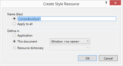
On Windows 8, this solution doesn’t work. This is because the default template for the ComboBox control differs between the different versions of Windows. To be able to change the background colour of a ComboBox in a WPF application running on Windows 8, you have to modify its default control template. To do this, you can right-click on the ComboBox element in design mode in Visual Studio 2012 or 2013 and select the “Edit template” option and then the “Edit a copy…” option. This will bring up a dialog that lets you specify the name and location of a style resource that is created for you when you click the “OK” button in the dialog:
You can then modify the generated template as per your requirements. To just change the background colour of the ComboBox, you should look for a ToggleButton Style with the x:Key attribute “ComboBoxToggleButton” – you can search in the XAML markup using the CTRL+F keyboard shortcut in Visual Studio – and change the Background property of the root Border in its ControlTemplate. It is set to a LinearGradientBrush resource with the x:Key attribute “ComboBox.Static.Background” by default. You could either replace this resource with your own Brush resource:
        <!-- Default LinearGradientBrush commented out  -->
        <!--<LinearGradientBrush x:Key="ComboBox.Static.Background" EndPoint="0,1" StartPoint="0,0">
            <GradientStop Color="#FFF0F0F0" Offset="0.0"/>
            <GradientStop Color="#FFE5E5E5" Offset="1.0"/>
        </LinearGradientBrush>-->
        <SolidColorBrush x:Key="ComboBox.Static.Background" Color="Yellow"/>
…or just replace the {StaticResource ComboBox.Static.Background} markup extension with a TemplateBinding to the Background property of the ComboBox in the ControlTemplate for the ToggleButton (x:Key=”ComboBoxToggleButton”):
<ControlTemplate TargetType="{x:Type ToggleButton}">
    <Border x:Name="templateRoot" BorderBrush="{StaticResource ComboBox.Static.Border}"
            BorderThickness="{TemplateBinding BorderThickness}"
            Background="{TemplateBinding Background}" SnapsToDevicePixels="true">
        <Border x:Name="splitBorder" BorderBrush="Transparent" BorderThickness="1" HorizontalAlignment="Right"
                Margin="0" SnapsToDevicePixels="true"
                Width="{DynamicResource {x:Static SystemParameters.VerticalScrollBarWidthKey}}">
            <Path x:Name="arrow"
                  Data="F1 M 0,0 L 2.667,2.66665 L 5.3334,0 L 5.3334,-1.78168 L 2.6667,0.88501 L0,-1.78168 L0,0 Z"
                  Fill="{StaticResource ComboBox.Static.Glyph}" HorizontalAlignment="Center"
                  Margin="0" VerticalAlignment="Center"/>
        </Border>
    </Border>
    <ControlTemplate.Triggers>
	...
    </ControlTemplate.Triggers>
</ControlTemplate>
<ComboBox Background="Yellow" Style="{DynamicResource ComboBoxStyle1}">
	<ComboBoxItem Content="One"/>
        <ComboBoxItem Content="Two"/>
        <ComboBoxItem Content="Three"/>
</ComboBox>
To change the background colour of the options in the ComboBox that are represented by ComboBoxItem elements – this is true even if the ComboBox’s ItemsSource property is bound to some source collection by the way – you can define an ItemContainerStyle for the ComboBox and set the Background and BorderBrush properties of the ComboBoxItem elements:
<ComboBox Background="Yellow" Style="{DynamicResource ComboBoxStyle1}">
            <ComboBox.ItemContainerStyle>
                <Style TargetType="ComboBoxItem">
                    <Setter Property="Background" Value="Yellow"/>
                    <Setter Property="BorderBrush" Value="Yellow"/>
                </Style>
            </ComboBox.ItemContainerStyle>
            <ComboBoxItem Content="One"/>
            <ComboBoxItem Content="Two"/>
            <ComboBoxItem Content="Three"/>
</ComboBox>
If you want to change the colour that appears when the mouse pointer is located over a ComboBoxItem you will have to change its default template in the same way that you change the default template for the ComboBox itself. Right click on the ComboBox element in the design view in Visual Studio again and then select the “Edit Additional Templates” option followed by the “Edit Generated Item Container (ItemContainerStyle)” and “Edit a copy…” options.
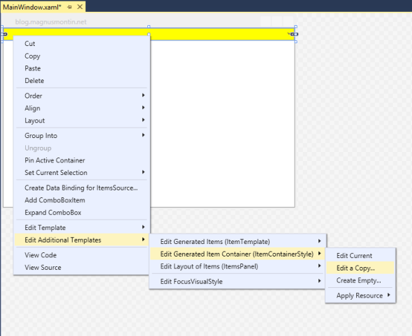

This will copy the default XAML markup for a ComboBoxItem into the location of your choice, i.e. Windows.Resources, Application.Resources or a custom ResourceDictionary. Then it is simply a matter of finding and changing the value of the Color property of the following SolidColorBrush resources:
<SolidColorBrush x:Key="ComboBoxItem.ItemsviewHoverFocus.Background" Color="#5426A0DA"/>
<SolidColorBrush x:Key="ComboBoxItem.ItemsviewHoverFocus.Border" Color="#FF26A0DA"/>
There are also a bunch of other resources that is used within the ControlTemplate of a ComboBoxItem that you can modify as you wish. The colours of the currently selected item is for example define by the following resources, all having an x:Key attribute value that starts with ComboBoxItem.ItemsviewSelected*:
<SolidColorBrush x:Key="ComboBoxItem.ItemsviewSelected.Background" Color="#3D26A0DA"/>
<SolidColorBrush x:Key="ComboBoxItem.ItemsviewSelected.Border" Color="#FF26A0DA"/>
<SolidColorBrush x:Key="ComboBoxItem.ItemsviewSelectedHover.Background" Color="#2E0080FF"/>
<SolidColorBrush x:Key="ComboBoxItem.ItemsviewSelectedHover.Border" Color="#99006CD9"/>
<SolidColorBrush x:Key="ComboBoxItem.ItemsviewSelectedNoFocus.Background" Color="#3DDADADA"/>
<SolidColorBrush x:Key="ComboBoxItem.ItemsviewSelectedNoFocus.Border" Color="#FFDADADA"/>
Note that if you copy and modify the default ItemContainerStyle according to the procedure mentioned above, you should not define your own inline ItemContainerStyle for the ComboBox. Instead of doing this, you could just set the values of the Background and BorderBrush properties inside the style resource:
<Style x:Key="ComboBoxItemStyle1" TargetType="{x:Type ComboBoxItem}">
    <Setter Property="SnapsToDevicePixels" Value="True"/>
    <Setter Property="Padding" Value="4,1"/>
    <Setter Property="HorizontalContentAlignment" Value="{Binding HorizontalContentAlignment, RelativeSource={RelativeSource AncestorType={x:Type ItemsControl}}}"/>
    <Setter Property="VerticalContentAlignment" Value="{Binding VerticalContentAlignment, RelativeSource={RelativeSource AncestorType={x:Type ItemsControl}}}"/>
    <Setter Property="Background" Value="Yellow"/> <!-- Custom value -->
    <Setter Property="BorderBrush" Value="Yellow"/> <!-- Custom value -->
    <Setter Property="BorderThickness" Value="1"/>
    <Setter Property="FocusVisualStyle" Value="{StaticResource FocusVisual}"/>
    <Setter Property="Template">
        ...
    </Setter>
</Style>
<ComboBox Background="Yellow" Style="{DynamicResource ComboBoxStyle1}"
          ItemContainerStyle="{DynamicResource ComboBoxItemStyle1}">
    <ComboBoxItem Content="One"/>
    <ComboBoxItem Content="Two"/>
    <ComboBoxItem Content="Three"/>
</ComboBox>
Finally, if you want to change the colour that appears when the mouse pointer is located over a not yet opened ComboBox you should look for resources with the x:Key attributes “ComboBox.MouseOver.Border” and “ComboBox.MouseOver.Background” and modify these:
<LinearGradientBrush x:Key="ComboBox.MouseOver.Background" EndPoint="0,1" StartPoint="0,0">
    <GradientStop Color="#FFECF4FC" Offset="0.0"/>
    <GradientStop Color="#FFDCECFC" Offset="1.0"/>
</LinearGradientBrush>
<SolidColorBrush x:Key="ComboBox.MouseOver.Border" Color="#FF7EB4EA"/>
Note that the built-in templates use different resources depending on the current values of various properties. For example, the ComboBox doesn’t use the above two resources when its IsEditable property is set to true. Triggers (and MultiDataTriggers) in the control template of a control decide which resources that are applied and under which conditions they are applied.
See Also
Styling and Templating: http://msdn.microsoft.com/en-us/library/ms745683(v=vs.110).aspx#styling_triggers
 Magnus Montin
Thanks!
You saved my time!
Thank you! Your explanation of the mouse over highlighting is EXACTLY what I’ve been looking for for weeks.
thank you, many useful, great
YOU SAVED MY FCKIN LIFE DUDE
I regret this is a mess. So many missing details I cannot figure out. These resources are not defined, so I had to remove them: BorderBrush=”{StaticResource ComboBox.Static.Border}”
Fill=”{StaticResource ComboBox.Static.Glyph}”
There was also a complaint about Binding (0) which line I didn’t understand.
Which having fixed the errors, I tested and found I still could not set the background. Using VisualStudio2017 and .net 4.5.1.
From
to the complexity explained above: That’s progress !
I am not a WPF fundi and I have to maintain a WPF app – one of the changes having to set the background colour of controls depending on certain events – so this is valuable indeed.
I fully agree with some of the comments I’ve seen on other webpages – the need to mess around like this in WPF just to change the background colour of a control is INSANE! and it’s one of the reasons why WPF will not be taking over the world anytime soon, neither in the near nor even the FAR foreseeable future!!! People just HATE it!!!